Good Practice: Schedule Trend Charts
Project Managers are inundated with many reports so usually prefer graphical reports for their simplicity. Trend analysis produces good graphical reports, such as Schedule Trend Chart, which track actual schedule performance and provide an indication of likely future performance.
According to PMI, "Trend analysis examines project performance over time to determine whether performance is improving or deteriorating. Graphical analysis techniques are valuable for understanding performance to date and for comparison to future performance goals in the form of completion dates."
Trend charts are easy to understand and can be used to show schedule performance over reporting periods for
Key Dates: how forecasted dates perform against baseline dates
Total Float: how current Total Float compare against Total Float in baseline
Contingency: how schedule buffers are being used up
Best time to set-up performance reports is during schedule baseline and trend charts are no exception. In this post, we will show how to set-up Key Dates trend charts and this post assumes you know how to insert charts in Microsoft Excel.
In a Valves Manufacturing Project, assuming we want to track how each Valve's Ex-work date at the end of each reporting month compares against the baseline, we will set up the chart's data table in Excel as shown in the figure below.
Cell A1 contains the name of the Valve we want to track
Cells C1 to R1 show our Project timeline, from Baseline at January 2014 to April 2015 and each column represents a monthly schedule update
Cells C2 to R2 represent the Valve's Baseline Ex-works date and since baseline dates do not change, the dates in these cells are all the same (05-Feb-15)
Cells C3 to R3 represent the forecast Ex-works date at the end of reporting period and since we are starting at baseline, Cell C3 has same date as the baseline (Cell C2)
To plot the chart, select Cells B1 to R3 and insert a Line chart (Line with markers option) to give us a chart as shown in the figure below.
The y-axis of the chart represents Ex-works date and x-axis represents monthly reporting period. At baseline, the trend line (blue) is a horizontal as expected and as the project progresses, this might change with each monthly update of the schedule. If the current or forecast trend line (red) is above the baseline trend line (blue), then we are forecasting delays to Ex-works completion but if the red line is below the blue line then we are forecasting early completion.
Fast forward to a year later and our chart is as shown in the figure below.
This shows the red line above the blue line and it shows that the red line keeps rising indicating continuous slippage when compared to baseline. Even though our Ex-works date has been slipping, the chart does not tell us if or how it affects the Valve's Need Date (i.e. the drop dead date for the Valve's completion).
To make our chart more meaningful, we will add the Need Date to our chart so that our data table and chart are as shown below.
The green line represents the Valve's Need Date trend and though it is horizontal in the example above, this date can change as the Project progress. So from the chart above, not only is the Forecast Ex-works much later than the baseline date, it is also later than the Need Date. When this happens, a recovery plan will be required (in reality, no one will wait for forecast Ex-works date to be as late as in the figure above before asking for a recovery plan).
Hope you found this post useful.
Addendum
There are other things you can do to the Trend Chart such as:
Adding a Predicted Completion Date line (extrapolation) to the chart based on different indices such as Schedule Performance to date etc
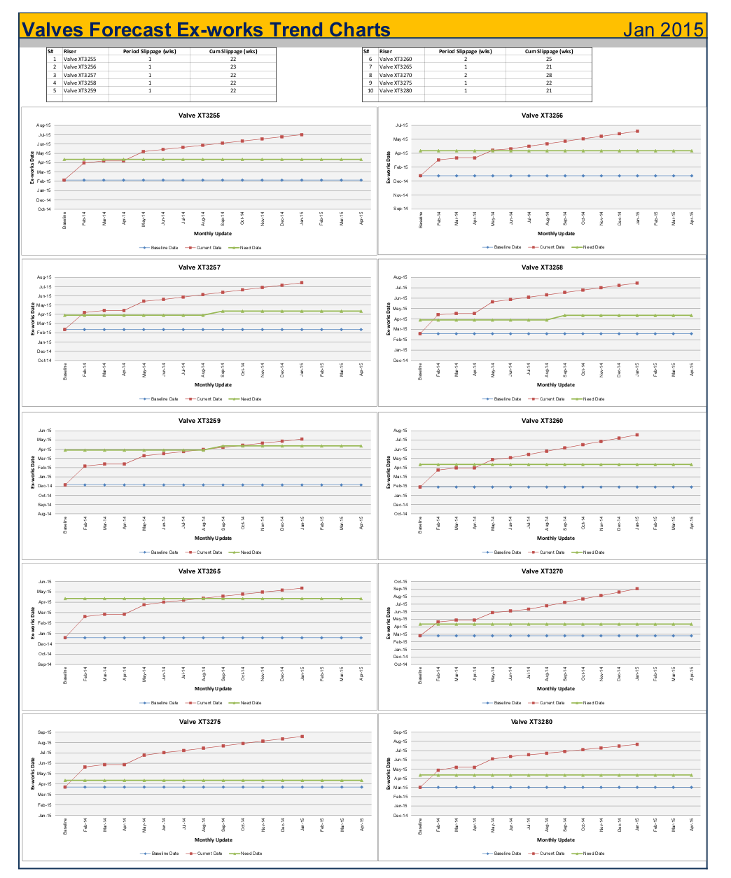
Presenting the Trend Charts in a dashboard and add details about slippage since last reporting period as well as cumulative slippage as shown in figure below.
References
Project Management Institute (PMI), 2013. A Guide to the Project Management Body of Knowledge. 5th ed. Newtown Square, Pennsylvania: Project Management Institute.


